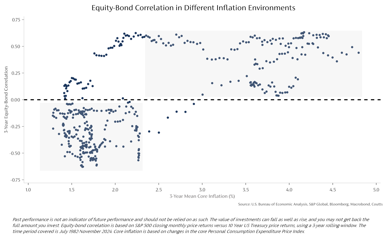
What’s most interesting about this chart is what happens when inflation reaches 3%. Below this value, equities and bonds express negative correlation – as you would expect.
But once inflation surpasses the 3% threshold (x-axis), their correlation turns positive (y-axis). Both asset classes move in tandem, so when one goes up, so does the other. And more concerningly, when one goes down, so does the other.
It’s worth noting that in a higher inflation environment, equities and bonds can both suffer. For equities, rising overhead costs can impede company profitability, though many firms mitigate this via raising prices or finding efficiencies.
For bonds, inflation has a more direct effect. When inflation rises, expectations of interest rate hikes also rise. This results in yields climbing and prices falling. A brief explanation of why prices fall when yields rise is that investors would prefer to buy newer bonds that come with a higher yield rather than an existing bond with a lower yield. Moreover, higher inflation reduces the future value of coupons – the regular interest paid to an investor of a bond– in real terms.
This creates the need for other diversifiers that behave differently from both equities and bonds.